View Poll Results: T-Shirt Design Preference
Concept A


2
4.65%
Concept B


13
30.23%
Concept C


2
4.65%
Concept D


20
46.51%
Concept E


7
16.28%
Concept F


9
20.93%
Multiple Choice Poll. Voters: 43. You may not vote on this poll
New Shirt
#1
New Shirt
nuhawk, 97wolverine, and I have been jumping around this shirt thing for the last couple of weeks and are ready for some input from all y'alls on your preferences. 97wolverine has been talking to his printing guy and we are shooting for possibly offering two different designs in the end depending on demand and abilities of the printer.
Input and preference is great b/c I can edit these things if there is enough interest in a different design direction or something I missed!
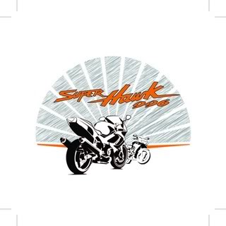
Concept A

Concept B

Concept C

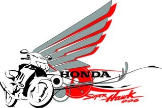
Concept D

Concept E

Concept F

Edit: the fuzziness is due to sloppy file conversion. Final designs will be crisp and clean!
Input and preference is great b/c I can edit these things if there is enough interest in a different design direction or something I missed!
Concept A

Concept B

Concept C

Concept D

Concept E

Concept F

Edit: the fuzziness is due to sloppy file conversion. Final designs will be crisp and clean!
Last edited by 7moore7; 09-30-2010 at 10:18 AM.
#5
A, B and C look like turkey tail feathers. If I'm going to buy one, my money would go for concept 'E'. It would be nice to lose the serifs, though.
Last edited by PUSHrod; 09-30-2010 at 12:13 PM. Reason: spelling
#6
#9
^^^^ Would love to do something like this. I'm not sure how versatile the printer we're using is b/c these things are much harder to setup on a screenprint. Different sized t's make it especially difficult!
#15
Since opinions are being given, here's mine...
How about A or B, but without the background (which looks like an oriental fan to me) on both the front and the rear.
All in all though, I prefer either A or B, as they are, over the others. My reason being that the design looks more balanced. And the background doesn't detract from the main image.
How about A or B, but without the background (which looks like an oriental fan to me) on both the front and the rear.
All in all though, I prefer either A or B, as they are, over the others. My reason being that the design looks more balanced. And the background doesn't detract from the main image.
#17
Since opinions are being given, here's mine...
How about A or B, but without the background (which looks like an oriental fan to me) on both the front and the rear.
All in all though, I prefer either A or B, as they are, over the others. My reason being that the design looks more balanced. And the background doesn't detract from the main image.
How about A or B, but without the background (which looks like an oriental fan to me) on both the front and the rear.
All in all though, I prefer either A or B, as they are, over the others. My reason being that the design looks more balanced. And the background doesn't detract from the main image.

#18
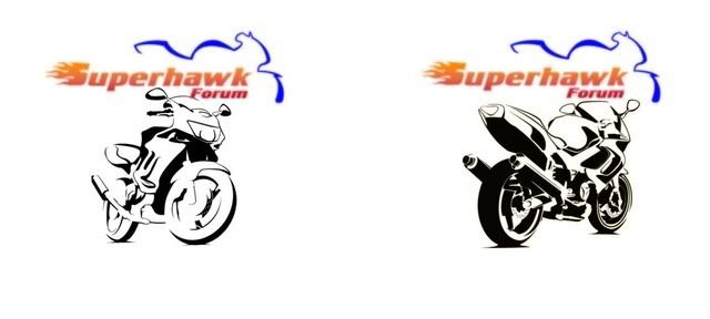
I think I was misunderstood. I like A and B as they are with the small forum logo on the front left "pocket" location, and the large image centered on the back of the t-shirt. I was just suggesting a version with the "turkey feathers" left off the front and back images. But either way is fine.
I also prefer the rear view of the bike in the foreground and the smaller front view in the background. The best view of the SuperHawk is looking from the rear, IMO...kind of like Jennifer Lopez.
To me, large images on the front of t-shirts look kind of gay...no offense intended towards anyone.
I also prefer the rear view of the bike in the foreground and the smaller front view in the background. The best view of the SuperHawk is looking from the rear, IMO...kind of like Jennifer Lopez.
To me, large images on the front of t-shirts look kind of gay...no offense intended towards anyone.
Last edited by VTRsurfer; 09-30-2010 at 06:22 PM.
#19
That back gets my final vote, hands down. It's simple, I like the true logo colors & the rear view. It won't be a difficult design to print. I'm not opposed to a large image on the front. The logo as in concept A, true colors small or large or the Honda wing w/ SH996 as in concept D for the front.
Also, I'll most likely be able to offer these in a limited amt. of different color shirts. Granted, the blue outline of the bike on the logo won't show good on a blue shirt, so certain colors may not be recommended. I'll talk to the printer when we agree on a final design.
Also, I'll most likely be able to offer these in a limited amt. of different color shirts. Granted, the blue outline of the bike on the logo won't show good on a blue shirt, so certain colors may not be recommended. I'll talk to the printer when we agree on a final design.
#21
I think I was misunderstood. I like A and B as they are with the small forum logo on the front left "pocket" location, and the large image centered on the back of the t-shirt. I was just suggesting a version with the "turkey feathers" left off the front and back images. But either way is fine.
I'm a fan of small front/large back as well. Again, we are possibly looking at doing two designs, so probably something with the big forum logo w/simple bike image and something along the lines of concept D.
I'll be out of town until Saturday night, so that'll give some time for more feedback (I'm listening, everyone!) and then it can get finalized.
And of course, constructive criticism highly encouraged
#22
We need to remember that we accepted these folks help. They bring their energy to a process and I don't think we need to over-labor their artistic interpretations.
Ian, I think the new stuff is fab. Certainly we need to consider the printing process as well as the price impact of "special events" like graphics changes or color changes.
I like all of it and I think you should take it over to Ryan and post up what he has to say. After all he (you included but he will take the rap) have to print the damn things!
Thanks for the new thread. I think this demonstrates how this forum is when it's at its best. WHEN ARE MINE GOING TO BE HERE?
Haha! Great job guys!
#23
^^ we'll certainly look into what Ryan has to say. As far as setup, a 2 color fade isn't that complex on a screenprint so he may not be opposed to it. It doesn't take any more setup... just a little extra caution when laying the ink...
#25
Originally Posted by nuhawk
We need to remember that we accepted these folks help. They bring their energy to a process and I don't think we need to over-labor their artistic interpretations.
#28
[quote
And of course, constructive criticism highly encouraged ...[/quote]
I like concept D front & back, looks a little more modern. Also like the Honda wings.
I don't like the "turkey feathers" or the rising sun, looks a little old fashion.
And of course, constructive criticism highly encouraged
I like concept D front & back, looks a little more modern. Also like the Honda wings.
I don't like the "turkey feathers" or the rising sun, looks a little old fashion.
#29
 Alright guys, we have 2 designs picked. I'm going to stop at the shop Monday morning and talk to Ryan about printing them and get an idea on final pricing. Thanks to everyone for your input.
 A HUGE thanks to Ian (7moore7). You hammered out some really cool designs. I'd like to have more than just two of them printed! I have to congratulate you on the final 2. They are awesome and I can't wait to be there and see some ink being laid!!


